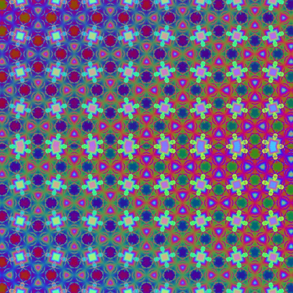
There are moments when a pattern feels less like a picture and more like an invitation. Chromatic Lattice is one of those pieces: a repeated geometry that hums with color and asks you to slow down, to let the eye trace the small shifts and the large rhythms. Blues, purples, and greens slip into one another like breath, and the regularity of the lattice is constantly surprised by subtle variations — a quiet tension between order and surprise.
I made this work because I wanted to explore how repetition can be living rather than static. Each tile is a microcosm: a square at its center, surrounded by petal-like echoes that push outward. Up close, the shapes read as individual motifs; step back, and the whole becomes an optical tide. That oscillation — the push and pull between detail and totality — is what keeps the piece in motion. Have you ever found your gaze wandering across a surface and then, almost without meaning to, settling into a single shape? That’s where the piece is at its most honest.
Color plays the lead role here. The palette is deliberately cool, but laced with unexpected warmth: cool teals and indigo fields punctuated by neon-tinged highlights that make the geometry sing. The chromatic transitions are not abrupt; they’re a controlled diffusion, creating a hypnotic rhythm that invites contemplation rather than overwhelming the senses. It’s music rendered visually — phrasing, tempo, and cadence recreated as hue and form.
In terms of presence, Chromatic Lattice works beautifully in a contemplative setting. Imagine it in a quiet study or a light-filled entryway where the slowly shifting colors can alter with the day’s light. Pair it with matte black or natural wood framing to keep the focus on the internal pattern, or go frameless for a more immersive, modern effect. If you want the image to become a room’s anchor, scale it generously; if you prefer an intimate encounter, a smaller print will draw viewers in closer.
Sustainability matters to me, and it informs how I bring this work into your space. For prints I recommend archival pigment inks on FSC-certified papers or recycled-cotton canvas — materials that respect both longevity and the planet. I produce limited runs, use eco-conscious packaging, and can arrange carbon-neutral shipping on request. Art should spark thought; it should not cost the Earth.
If Chromatic Lattice is calling to you, I’d love to hear where you imagine it living. Do you see it warming a minimalist dining room, animating a creative studio, or offering a quiet focal point in a reading nook? Tell me — these pieces are made with you in mind, and every placement becomes part of the story I hope the work helps tell.