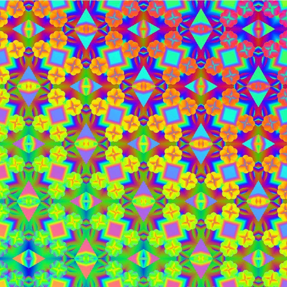
There are moments in the studio when colors insist on a life of their own — a hum in the back of my mind that grows louder until I have no choice but to follow it. Neon Gradient Kaleidoscope began as one of those moments: a tiny experiment with a single petal-like shape, mirrored and multiplied until the pattern began to breathe. What emerged felt electric and intimate at once — a psychedelic lattice of geometry and floral echoes that seems to move when you look at it, like a secret rhythm waiting to be heard.
I wanted this piece to do two things simultaneously: to ignite and to soothe. The concentric gradients pull you outward, while the repeating diamonds and petal clusters invite closer inspection. Bright cyan softens into magenta, then melts into buttery yellows and verdant greens; the palette reads like a sunset sped up and refracted through a prism. It’s playful, yes — but there’s also a deliberate structure beneath the joy: symmetry, repetition, and careful layering that give the work depth and a kind of meditative cadence.
Creating Neon Gradient Kaleidoscope was a process of letting rules guide intuition. I started with precise geometric anchors and then surrendered parts of the design to color play — gradient maps, subtle blurs, and overlays that allowed hues to interact in unexpected ways. The floral motifs are not literal flowers but impressions of bloom: small, repeated gestures that soften the angles and add a human, organic pulse to the crisp geometry. The result is a pattern both mathematical and emotional, a visual paradox I return to again and again.
Where does a piece like this live? Honestly, pretty much anywhere you want to invite curiosity. It transforms a quiet reading nook into a conversation starter, animates a studio wall without overpowering it, and makes a calming yet invigorating backdrop for creative work. Consider using it as a statement wallpaper in a single wall for an otherwise neutral room, or as a series of framed prints that allow each section of the pattern to reveal its own personality. I also love it translated to textiles — a silk scarf, a throw pillow, or an upholstery swatch, where the tactile element plays against the sheen of the gradients.
Sustainability matters to me, so when I think about bringing this work into your space I imagine responsible choices: archival prints on recycled cotton rag paper, low-VOC inks for home-friendly colors, and packaging that’s simple and recyclable. Art should enliven our lives without costing the planet extra weight.
If you find yourself lingering on one corner of the pattern, asking why certain colors pair that way or how the symmetry resolves where it does, I’d love to hear your thoughts. Want a warmer version, or a variant with a more muted palette for a bedroom? I enjoy custom explorations — color shifts, scale adjustments, even reworking the motif for textiles or large-format installations.
So, take a moment with Neon Gradient Kaleidoscope. Let it be loud enough to wake a room and subtle enough to reward repeated viewing. What does it make you feel? What corner of your life would you like it to brighten?